

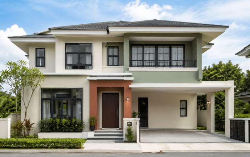
Your home’s exterior creates its first impression while protecting the building from Singapore’s sun, rain and humidity. A well-planned exterior wall paint colour combination should complement the architecture and remain visually balanced from the street.
Whether you prefer timeless neutrals or a bolder façade, the ideas below can help you build a cohesive palette. You will also learn how to choose exterior paint that can withstand local weather conditions.
Key Takeaways:
|
How to Choose the Right Exterior Wall Paint Colour Combination
Start with the features you cannot easily change, then build a balanced colour palette around them.
Consider Your Home’s Architectural Style
Modern, minimalist and industrial homes often suit restrained combinations of white, grey and charcoal. Scandinavian designs pair naturally with warm neutrals, while colonial and traditional façades can carry cream, deep green or dark brown accents.
Take Your Surroundings Into Account
Look at the greenery, neighbouring façades and streetscape around your home. Coastal settings may suit muted blues and off-whites, while urban areas can support sharper contrasts. A narrow terrace may feel more open in lighter shades; a detached bungalow can usually accommodate deeper colours without appearing enclosed.
Choose a Dominant, Secondary and Accent Colour
Use the 60-30-10 rule as a flexible guide: apply the dominant colour to about 60% of the exterior, the secondary colour to around 30% and an accent to the remaining 10%. The main walls form the base, architectural features provide the secondary colour, and doors, gates or trims carry the accent.
Consider Sunlight and Lighting
Exterior colours often appear lighter and brighter in direct sunlight. Test larger samples on different sides of the house and review them in the morning, afternoon and overcast conditions before deciding.
8 Exterior Wall Paint Colour Combination Ideas
1. Classic and Timeless
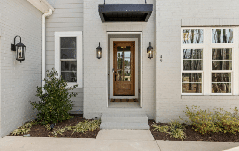
Suggested palette: warm white or cream + beige or greige + dark brown
Warm whites and creams create a welcoming base without the sharpness of brilliant white. Add beige or greige to columns and ledges, then use dark brown on the gate or front door for definition.
2. Modern and Minimalist
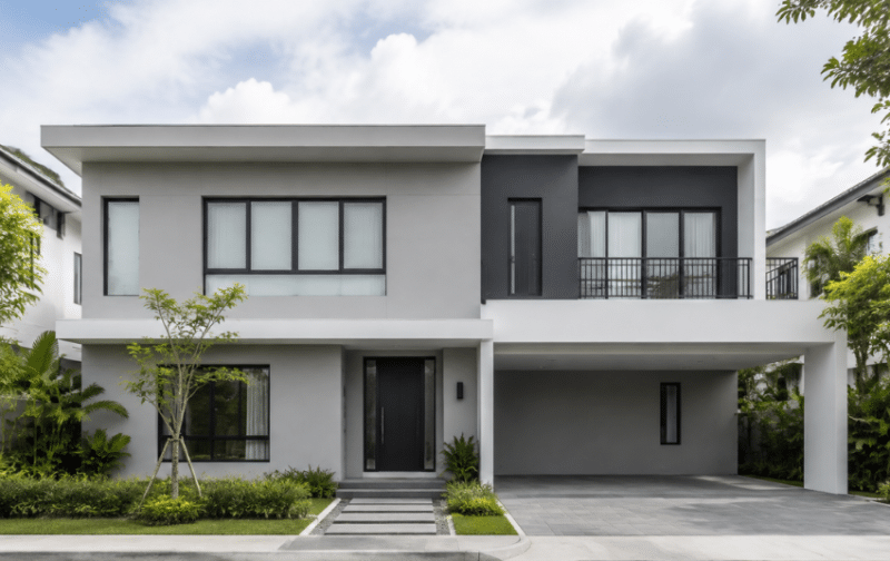
Suggested palette: light grey + charcoal + white or black
A monochrome scheme draws attention to clean lines and geometric forms. Keep most walls light grey, use charcoal on a recessed section or upper storey and reserve black or white for frames and trims.
3. Bold and Dramatic
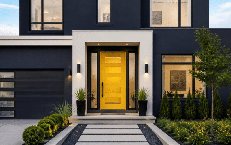
Suggested palette: deep navy or charcoal + off-white + mustard or terracotta
Dark main colours can give a large façade greater depth, while a bright door introduces personality. Use highly saturated shades sparingly, especially on sun-exposed walls, and choose fade-resistant exterior paint to help preserve the result.
4. Nature-Inspired and Earthy
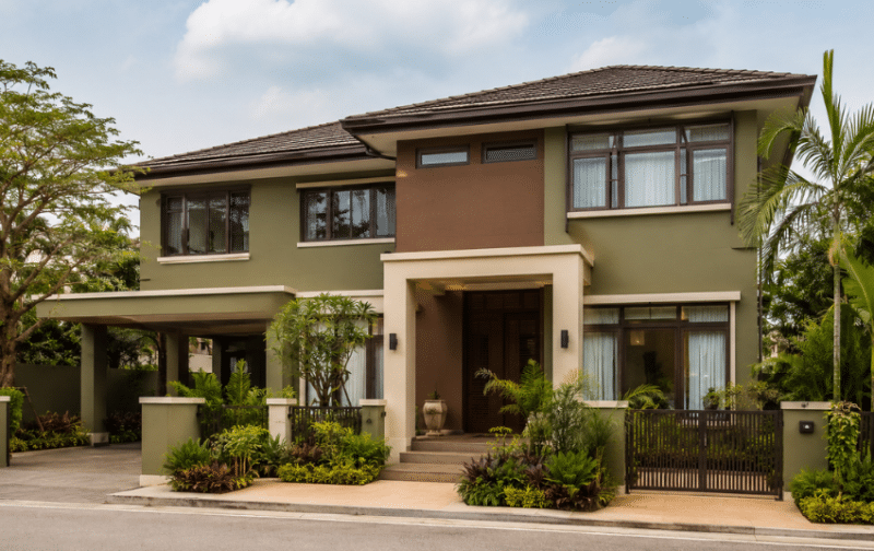
Suggested palette: sand or warm beige + olive or sage + terracotta or brown
Earth-derived shades allow the building to sit comfortably among plants, stone and timber. A sandy base keeps the façade light, while olive, terracotta or brown can define balconies and entrance areas.
5. Coastal and Fresh
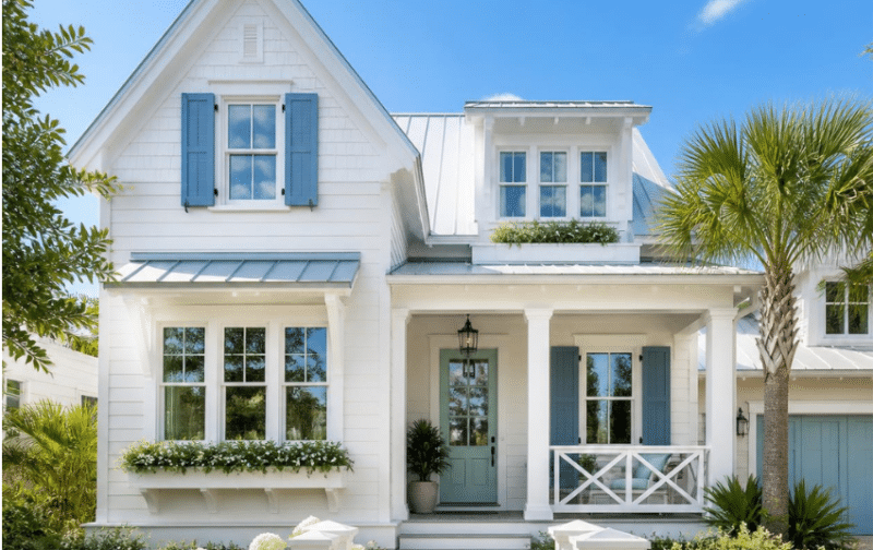
Suggested palette: off-white + muted blue + seafoam or pale grey
This airy combination takes its cues from the sea and sky without looking overly themed. Use off-white across broad wall areas, muted blue on selected features and a restrained seafoam accent for the door or gate.
6. Warm and Tropical
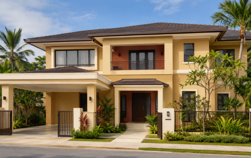
Suggested palette: light ochre or sun-baked beige + terracotta + cream
Ochre and terracotta bring warmth to tropical architecture and work well with clay roof tiles or natural timber. Select lighter versions for large sun-facing walls, using the richer tone only on smaller features.
7. Pastel and Playful
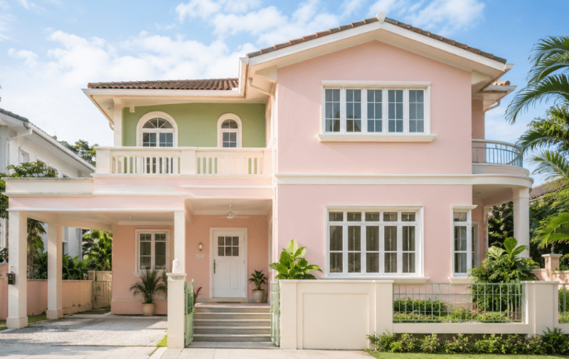
Suggested palette: blush, mint or soft sage + white + a deeper coordinating accent
Pastels introduce colour while keeping the exterior light and approachable. Crisp white trims prevent the scheme from appearing washed out, while a contrasting pastel section creates a clear focal point.
8. Heritage-Inspired
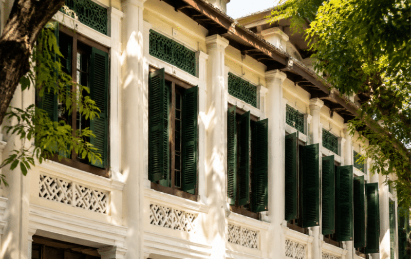
Suggested palette: off-white or cream + deep green or charcoal + dark brown
Cream walls paired with deep green, charcoal or dark timber details suit colonial and traditional façades. Apply the darker tones to shutters, railings or doors so the building retains the light, stately appearance associated with heritage homes.
Popular Exterior Wall Paint Colour Trends
Unlike the ready-to-use palettes above, these trends show the broader colour directions shaping contemporary façades. For more colour forecasting and inspiration, explore Nippon Paint’s Trend Beyond Colours 2026-27.
Warm Neutrals
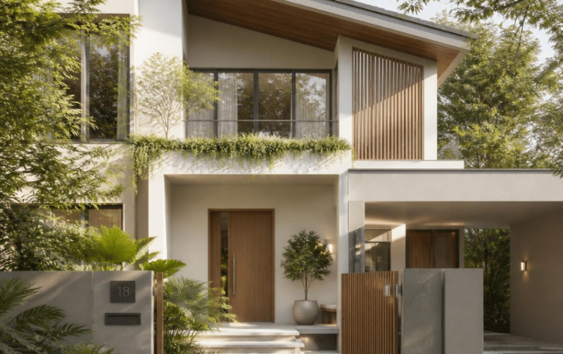
Greige, taupe and warm white are replacing colder neutral schemes. Their subtle yellow or brown undertones soften modern façades and coordinate easily with timber, stone and landscaping.
Earthy Colours
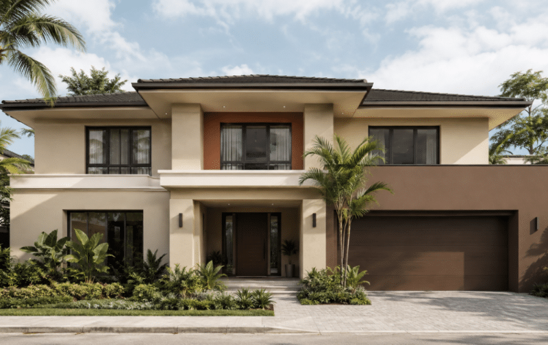
Sand, clay and muted brown give exteriors a grounded quality. They work particularly well where the design already includes terracotta roof tiles, brick or warm-toned stone.
Nature-Inspired Greens
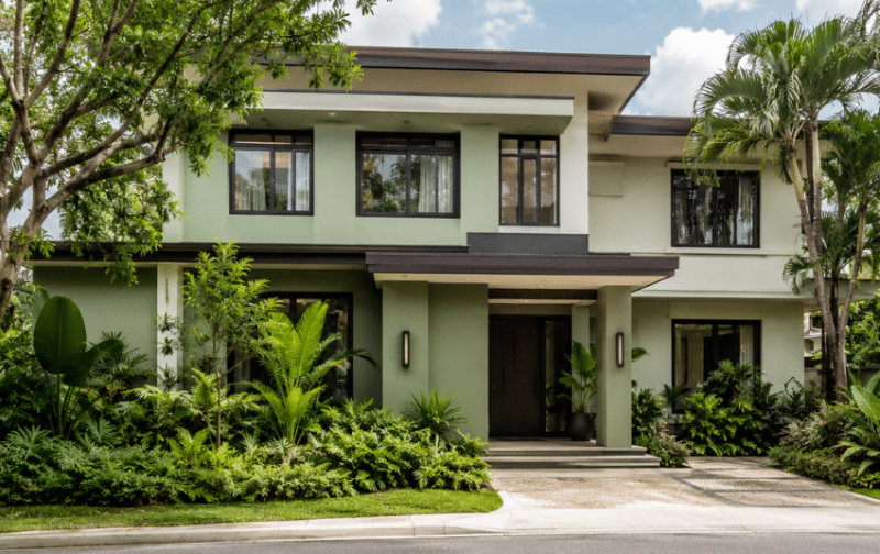
Sage, olive and moss green connect the building visually with surrounding plants. Rather than covering the entire façade, many schemes use green on an upper level, recessed section or entrance feature.
Deep Charcoal
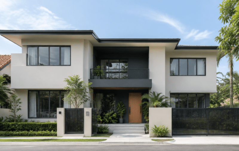
Charcoal continues to appear on modern exteriors because it adds strong architectural definition. Pair it with a pale base and limit it on highly exposed surfaces if heat absorption or visible fading is a concern.
Off-Whites
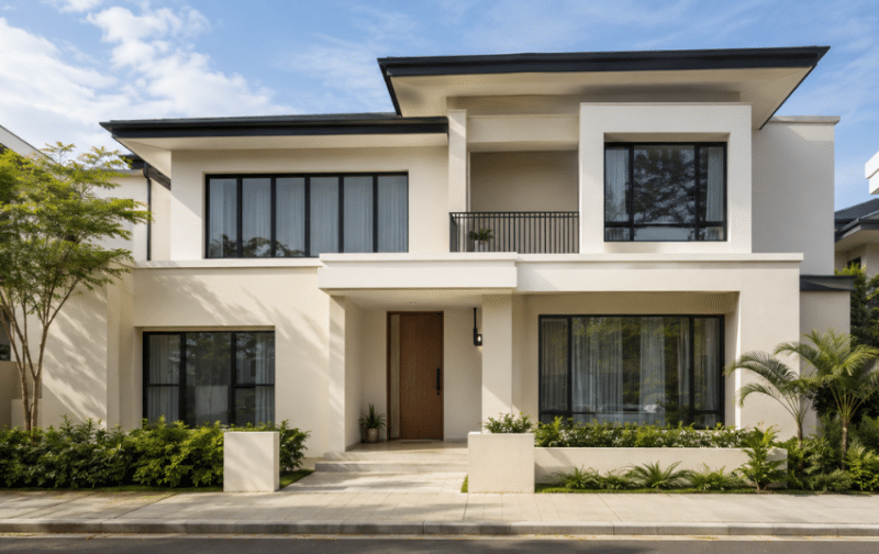
Homeowners are moving beyond stark white towards ivory, stone white and pale greige. These shades retain a bright appearance while feeling softer and may be more forgiving of light dust or splash marks.
Two-Tone Façades
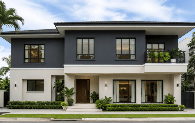
Two-tone schemes use colour to separate storeys or highlight an architectural volume. The strongest results repeat one shade on a smaller detail, such as the gate or window frame, to connect the façade visually.
Choosing the Right Exterior Wall Paint
The right exterior paint should preserve your chosen colour combination while protecting the walls from local weather conditions. Consider the finish, protective features and long-term upkeep before selecting a product.
Match the Finish to the Surface
Matt and low-sheen finishes minimise glare and make minor surface imperfections less noticeable, so they work well on broad exterior walls. Semi-gloss or gloss finishes are easier to clean but highlight unevenness, making them better suited to doors, gates and trims.
Prioritise Protection Against Tropical Weather
Use a dedicated exterior paint designed to resist intense sunlight, heavy rain and humidity. Depending on the product and location, useful features include:
- UV and weather resistance
- Protection against fungal and algal growth
- Fade resistance and good colour retention
- A durable finish suited to the exterior surface
Nippon Paint’s Weatherbond AlgaeGuard is a low-sheen exterior paint with fungal and algal resistance, anti-streak mark properties and fade resistance. For façades that receive strong solar exposure, SolarShield reflects solar energy and can reduce the surface temperature by up to 5°C. Refer to the exterior paint guide for the recommended primer and top-coat system.
Check Whites and Undertones Carefully
White paint may carry warm yellow, cool blue or grey undertones that become more obvious beside the roof, paving and neighbouring colours. Brilliant white can also make dirt streaks and splash marks more noticeable, while off-whites and pale greiges may be more forgiving over time.
Compare several samples outdoors rather than choosing from a screen alone. You can browse Nippon Paint’s colour range to shortlist suitable options before checking physical samples.
Plan for Maintenance and Repainting
Inspect exterior walls periodically for fading, chalking, cracks, peeling paint or biological growth. Understanding how to prevent wall paint from fading can help you protect the finish through suitable product selection, proper surface preparation and timely maintenance.
Exterior walls commonly need repainting after about five to seven years, although the actual interval varies with exposure and the condition of the coating. Repaint when the finish begins to deteriorate rather than relying on age alone.
Bring Your Exterior Colour Combination to Life
The best exterior palette balances personal taste with the home’s architecture and surrounding environment. Once you have shortlisted your colours, review them outdoors and confirm that the selected paint system is suitable for each surface.
For a fuss-free result, engage Nippon Paint’s professional painting service. Exterior painting packages are available for landed homes and include a five-year warranty when the recommended system is used. Enquire today to arrange a site assessment and receive a non-obligatory quotation.
FAQs About Exterior Wall Paint
How many colours should I use on a house exterior?
Two or three colours are usually sufficient: one for the main walls, one for architectural features and an optional accent for doors, gates or trims. Using more can work, but the shades should repeat consistently across the façade.
What exterior colours increase home value?
No paint colour can guarantee a higher property value. However, well-maintained neutral schemes such as warm white, greige or soft grey generally have broad appeal and allow prospective buyers to imagine the home in their own style.
What colours make a small house look bigger?
White, off-white, pale beige and light grey reflect more light and can make a compact exterior appear more open. Keeping the main walls and trims relatively low in contrast also reduces visual breaks across the façade.
What colour goes well with a grey roof?
Off-white, warm grey, muted blue and sage green can all complement a grey roof. Check whether the roof has a warm or cool undertone, then choose exterior colours with similar undertones for a cohesive result.
Which exterior paint colour fades the least?
Lighter neutrals such as off-white, beige and light grey tend to show fading less visibly than deep or highly saturated colours. Paint quality, UV exposure and surface preparation also have a major influence, so use a fade-resistant exterior formulation.
What are the best exterior colours for hot or tropical climates?
Light shades such as off-white, pale beige and light grey reflect more solar energy than darker colours and are practical for broad, sun-exposed surfaces. If you prefer a dark or warm palette, use the deeper shade as an accent and consider a solar-reflective exterior coating for exposed walls.
14 Wall Paint Design Ideas For Your Home