Introducing a green colour palette to your home design is a great way to bring a touch of nature and the outdoors into your living space. Symbolising both tranquillity and stability, you can create a wholesome enclave for your home with this versatile colour.
Create confident, bold looks with stronger shades of green, or something a little more calming with muted greens in a cool or neutral palette. Alternatively, go for a rustic and natural-looking design or one based on Feng Shui to promote harmony. The possibilities are endless!
Looking for inspiration? We’ve brought together some helpful tips and gorgeous design ideas for you based on our colour paint chart. Check out these 9 green colour palettes looks to liven up your bedroom and interiors, including the benefits of using green and 4 expert tips!
Best Green Colour Palettes for Your Home’s Interior Design
Choosing other colours to go with such a versatile colour as green can be a challenge; we’ve all been there. This is particularly true if you’re only at the start of your design journey.
So we’ve pulled together some of the more common colour palettes for green to give you a place to start. Use these as stepping stones to build the right colour palette for your home.
1. Bold green with contrasting colours
When you add contrast to your home’s interior design, it can be a key element in helping to pull the whole space together.
Balancing warm and cool colours can add personality and interest. You can contrast a cool green with warm yellows and oranges in accents, furniture or rug choices.
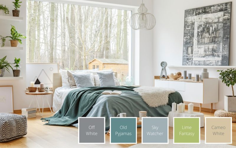
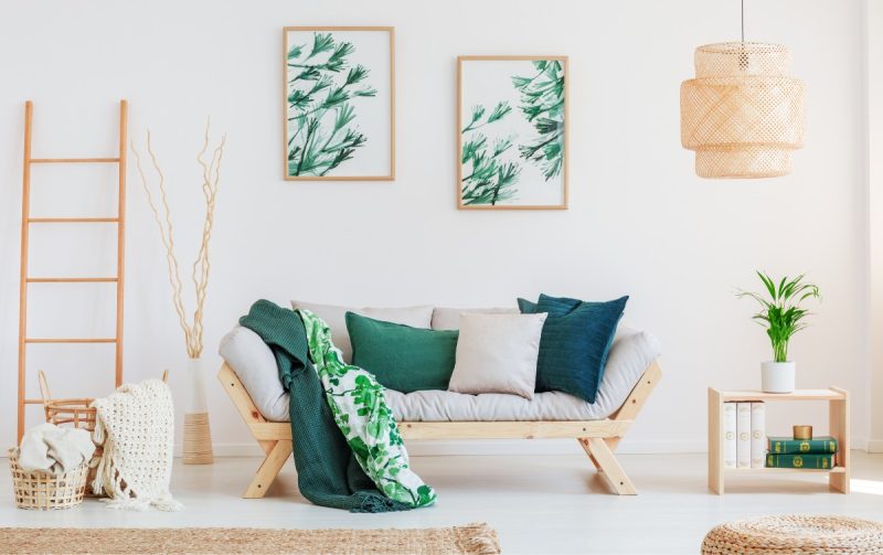
2. Blue and green colour palette
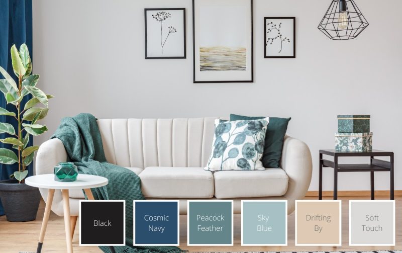
Blue and green — these complementary colours are a natural fit, as neighbours on the colour wheel. Deep, strong colours like these can still be a part of a light, airy room when done in combination with the right colours. Think muted earthy tones or light, airy greys, creams and whites.
A grey or white room with blue and green accents can add depth, visual interest, and a soothing quality.
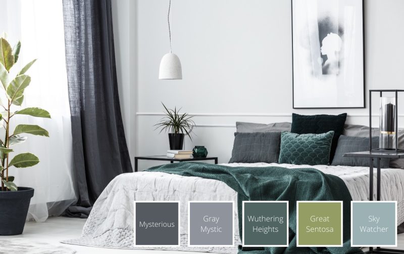
3. Forest green and deep blue colour palette
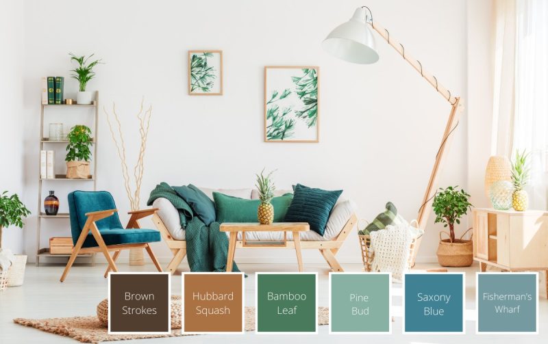
If you prefer the richer, darker hues, a forest green and deep blue combination may be the right palette for you. More saturated hues like this are good for making a space feel cosy, or for brightening up a dimmer room.
With the deeper hues as primary colours rather than accents, this could be an ideal choice for a bedroom, or a smaller living room.
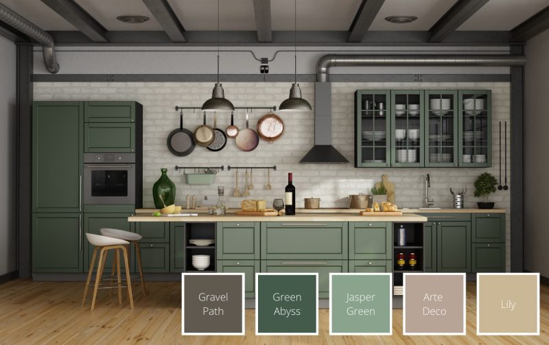
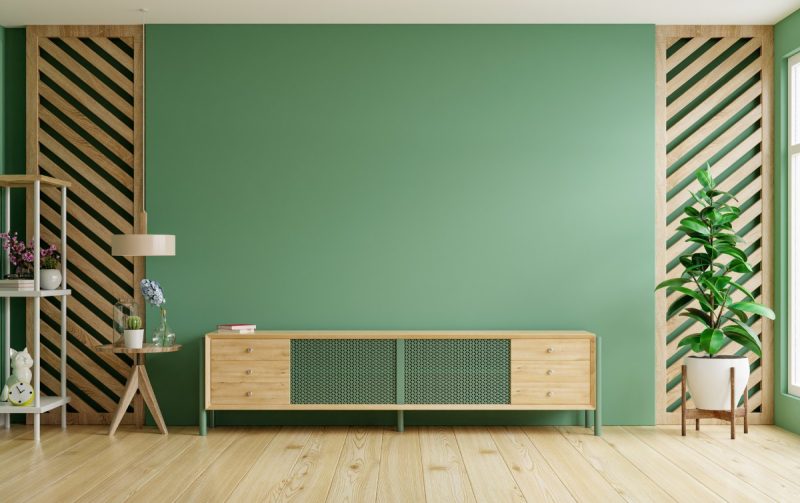
4. Modern emerald green palette
An emerald green palette is a modern, elegant and timeless use of the colour. Sometimes emerald is also called “bottle green” or “ocean green”. It’s a visually strong and arresting colour and can be used as the primary wall colour or in accents only.
Generally, emerald earth colours tend to be the best match for a harmonious room. Either silver or gold can be metallic accents with emerald to bring out further elegance.
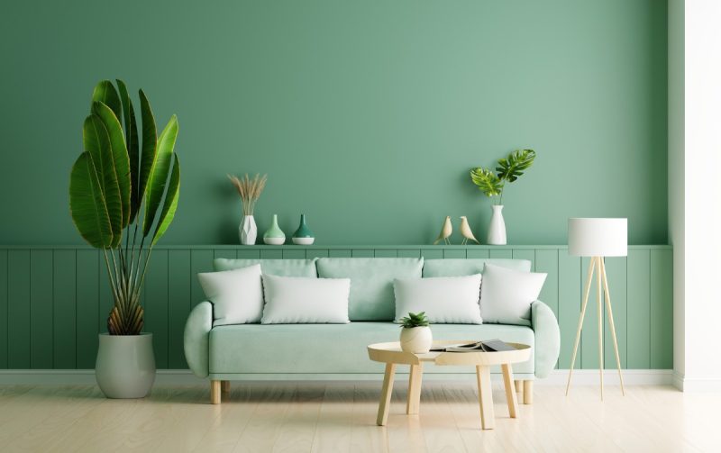
5. Pastel green with muted colours
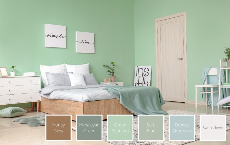
A pastel green with muted colours can be a compelling choice to create a relaxing space for a child or teen. If the room is well-lit, the lighter hues will reflect more light into the space.
Additionally, the lighter, softer and more delicate colours would go well in a more industrial space or one with heavier furniture. In fact, a pastel colour paint like this green can provide balance and soften the harder elements of the space.
6. Apple green for a pop of colour
An apple green can be a difficult colour to work with, perhaps because it’s a bit more vibrant. It’s not impossible, though. Offsetting it with warm neutrals can mellow and integrate the brightness of the crisp green.
In the kitchen, using it as an accent wall or in accessories can bring in a much needed dose of zest and cheer.
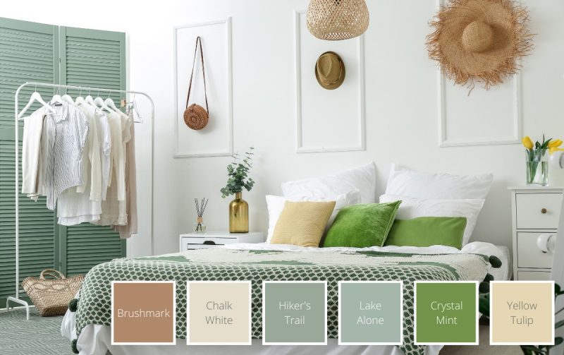
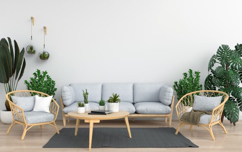
7. Green and neutral colour palette
Green is a natural choice for a neutral colour palette. It adds a level of visual interest while at the same time creating visual rhythm. By adding a pop of lime green or a luxurious touch of a cooler, deeper green, it’s easy to elevate a minimalist, neutral Scandinavian colour scheme.
You can also use a single piece of green furniture like a sofa to create depth and a focal point in a primarily neutral room.
Adding greens to an otherwise neutral colour palette like this can also create an old-world refinement that could perfectly suit a breakfast nook in the kitchen, or a small, relaxed space like a reading cosy.
8. Rustic green colour palette
Rustic colour palettes create a homey space by using and enhancing natural textures like stone, wood, and plants. The welcoming natural finishes are echoed in warm earth tones, ones that recall the outdoors: soft pinks and browns, warm whites, greys, tans, and strong greens.
Softer and more pastel greens may not balance a rustic design well. Many designers prefer working with deeper tones like moss green in rustic designs, to support and balance the natural beauty of the other textures in the room.
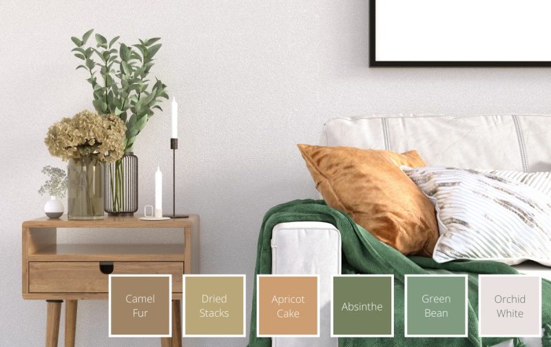
9. Sage green and yellow palette
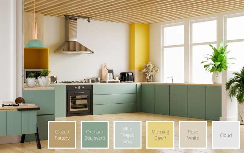
Sage is one of the cooler green colours, and yet can also work as a neutral in your home. It’s soft, and plays off the light of your home well, so it sits nicely with whites, creams and other warm neutrals.
We chose a contrasting, summery yellow with the earthy sage green to elevate the green and add a bit of strength to the otherwise soft colour.
Benefits of Using a Green Colour Palette in the Home
Colour psychology can be an important part of how we feel in our home. The colours we choose can directly impact how happy, healthy, relaxed, social or creative we feel. And who doesn’t want to feel relaxed in their home?
Green can help our mental state in a few ways, beyond how much we like the space we’re living in. Here are some benefits of a green colour palette.
Creates a calming environment
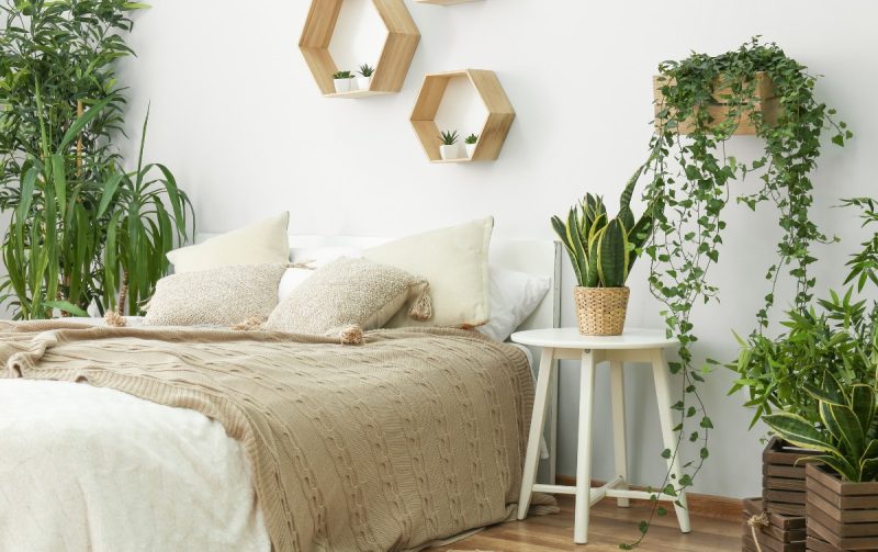
Colour can have a considerable impact on our moods, and green is no different. Scientists think green may be instinctually connected to safety for humans, which is why so many find it calming. Shades of green can help put people at ease in new places.
So if you’re looking for a new colour to put in your bedroom, consider green, as it may be the final step to creating your home oasis.
Boosts productivity
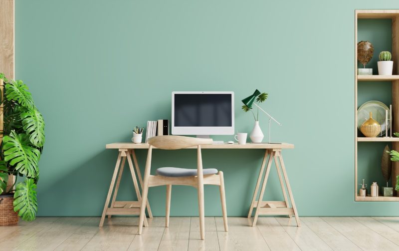
Green is also linked to creativity. Again, scientists think this is, in part, an instinctual positive association. It’s also reinforced in our community, where we “give the green light” to move forward with a new project.
For this reason, amongst others, consider green when creating or redoing an office or creative space. The natural inclination to include plants is a good idea, too.
If you’re looking for a quiet, productive space, consider a light shade of green. Add a bright pop of saturated colour for a touch of joyous energy.
Tips for Creating a Green Colour Scheme at Home
Green is a versatile colour and can sit well with pretty much every type of colour scheme and style. It’s only a part of the equation though, so in this section we’ll share interior design tips that should help you incorporate green into your home seamlessly.
Match greens with other cooling colours
Along with the complementary colours of green and blue, consider adding purple in the mix. Because they are all next to each other on the colour wheel, you can experiment mixing and matching saturation, hue and value (how much white or black is in the colour) without fear of clashing.
If you have a dimly lit bedroom, rather than choosing white, consider choosing a saturated mid-tone. The cool range of blues, greens and purples is a spot-on choice to help brighten up spaces with little natural light.
Darker, more saturated tones are often a good choice if you’re looking to create a cosier space.
Keep it simple with neutral colours
Because green is so synonymous with the outdoors, some interior designers actually use green as a neutral colour. So if you’re looking for a timeless and elegant space, consider adding green accessories to your neutral palette. It shouldn’t be too much of a shock to the eye, and will add that visual interest to help the room feel fresh and balanced.
Adding green into an otherwise neutral palette of greys, whites or browns can also break up the space.
Use it on an accent wall
There are many ways to create visual rhythm or break up spaces in a room — and one of those options is a feature wall. For example, if your living space and your work space are in the same room, consider using a green accent wall to create that separation. This will visually show that your workspace is a different “room”.
Accent walls are also a place in your home to showcase your creativity and perspective. It’s a good way to add some texture, ombre, or another feature element.
Consider Feng Shui when choosing colours
In Feng Shui, green plays a pivotal role in creating a balanced home. It’s a wood element and regardless of how much or little of the colour you use in your space, green brings good energy. It’s also associated with personal and financial growth as it encourages breakthroughs.
Green is an ideal colour to include in the kitchen to encourage strong family ties. It’s also something to consider softly including in a child’s bedroom to encourage proper development. The bathroom, where we cleanse and rejuvenate, is also a good place to consider the balancing energy of wood to promote clarity.
The Timeless Versatility of Green
As we can see, green is a colour that can open up whole new worlds of ideas and promote balance and good energy. Calming or creativity-boosting, warm or cool, main colour, accent or feature, green is spectacularly versatile.
Regardless of the kind of space you’re looking to create, there’s probably a shade of green that works for you. When you use it in your space, it’ll bring something valuable to your mind, body and home.
8 Trendy Neutral Colour Palette Ideas to Get Your Rooms Dripping in Style