A paint colour that looks perfect on a phone screen or in a magazine can look completely different on your walls — and by the time you find out, you have already spent a weekend painting. Colour is affected by the light in your room, the tones in your furniture, and the proportions of the space itself. Without a structured approach, the gap between the colour you imagined and the one you end up with can be significant.
The good news is that the process becomes much more manageable with a few established principles behind you. These four tips — used by interior designers and colour consultants — give you a practical framework for choosing colours that work together and suit your home, rather than colours that simply looked good in isolation.
1. Start with Your Furniture, Not Your Walls
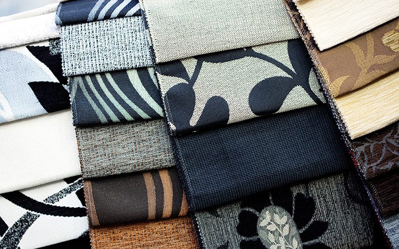
The most common mistake homeowners make when repainting is choosing wall colours first. It feels like the logical starting point — walls are the largest surface in the room — but it actually limits your options significantly, because you then have to find furniture, textiles and soft furnishings that fit a colour you have already committed to.
The more effective approach is to work in the opposite direction. Start with the items that are hardest to change: your existing furniture, rugs, artwork and any fixed finishes like flooring or cabinetry. Identify the dominant colours and undertones in these pieces, then choose a wall colour that complements them.
This is particularly useful when choosing a neutral. Whites and beiges are not interchangeable — some read warm (cream, linen, warm white) and others read cool (bright white, grey-white). The right neutral for your walls is the one whose undertones align with the existing tones in your furniture and floor. Hold paint swatches against your sofa fabric, your rug and your curtains in natural light before committing to anything.
2. Use the Colour Wheel as a Starting Point
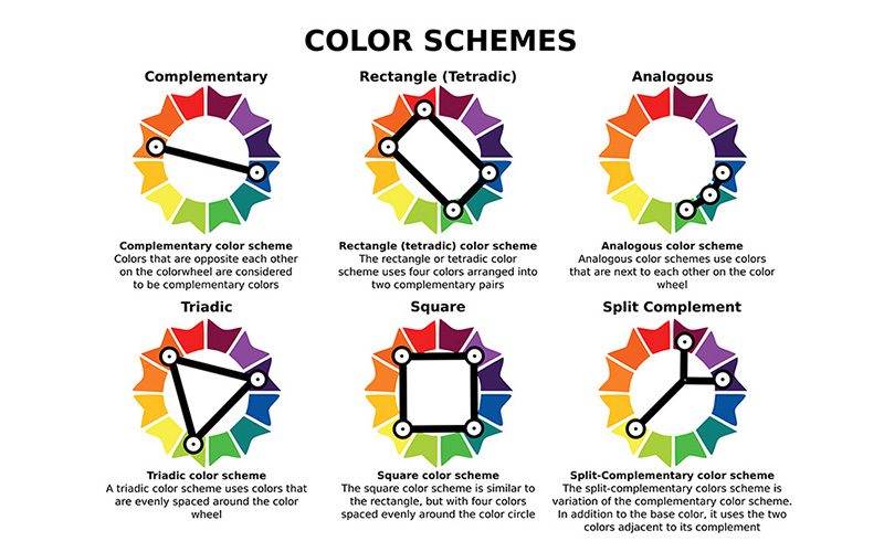
If you already have a strong preference for a particular colour, the colour wheel is one of the most practical tools available for building a palette around it. Rather than guessing which colours will work together, the wheel gives you a set of proven combinations to choose from.
Three of the most useful schemes for home interiors are:
Monochromatic — using different shades, tints and tones of a single colour. This creates a calm, cohesive look that is difficult to get wrong. A room in varying shades of blue-green, for example, can feel layered and considered without ever feeling busy.
Analogous — using colours that sit adjacent to each other on the wheel, such as blue, blue-green and green. Analogous palettes feel harmonious and natural, and work particularly well in living areas and bedrooms where the goal is a relaxed, unified atmosphere.
Complementary — using two colours that sit directly opposite each other on the wheel, such as blue and orange, or green and red. This is the boldest of the three schemes and, used well, creates strong visual energy. The key is balance: let one colour dominate and use the other as an accent rather than splitting the room equally between them.
You do not need to use these schemes rigidly — they are starting points, not rules. But they remove a lot of the uncertainty from colour selection by giving you combinations that have an established logic behind them.
3. Apply the 60-30-10 Rule for a Balanced Room
One of the most widely used principles in interior design colour planning is the 60-30-10 rule, sometimes called the golden ratio of colour. It provides a simple framework for distributing colour across a room so that the result feels intentional and balanced rather than chaotic or flat.
The principle works as follows: 60% of the room’s visual presence is your dominant colour — typically the walls, ceiling and largest furniture pieces. This colour sets the overall tone and mood of the space, so it should be one you are genuinely comfortable spending time in. The next 30% is your secondary colour, applied through accent furniture, curtains, trims and larger textiles. This colour adds depth and interest to the dominant tone without competing with it. The final 10% is your accent colour — the boldest of the three, used sparingly in decorative objects, cushions, artwork and smaller accessories. This is where you can introduce something more distinctive or striking without overwhelming the room.
The 60-30-10 ratio is a guideline, not a formula — rooms with unusual proportions or strong architectural features may call for adjustment. But as a starting framework, particularly for homeowners who want a coherent result without a background in design, it is a reliable place to begin.
4. Visualise Before You Commit
Even with a clear palette in mind, colours behave differently in different rooms. The natural light in your space, the direction your windows face, the height of your ceilings and the colours of your flooring all affect how a paint colour actually looks on your walls — often very differently from how it appeared on a swatch or a screen.
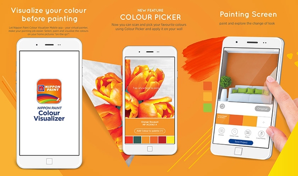
Before committing to a full room, the Nippon Paint Visualiser — available via the Nippon Paint mobile app — allows you to preview colours directly on your walls using your phone camera, compare different colour schemes in your actual space and share the results with family members or a designer for a second opinion. This removes a significant amount of guesswork from the decision and makes it far easier to identify whether a colour that looked right in theory actually works in your specific room.
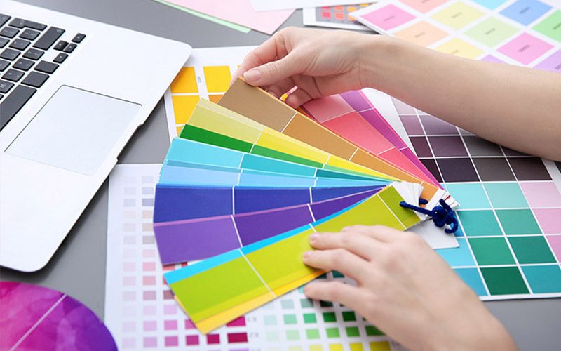
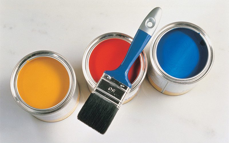
Source: Africa Studio — Shutterstock
If you want more personalised guidance, Nippon Paint’s professional painting service includes expert colour consultation — useful if you are dealing with an open-plan space, unusual lighting conditions, or simply want a professional eye before committing to a major repaint.
Frequently Asked Questions
How do I choose the right paint colour for a small room?
In a compact room, lighter colours generally make the space feel more open and airy by reflecting rather than absorbing light. Cool neutrals — soft whites, light greys, pale blues — work well. If you want to use a deeper colour, consider applying it to a single feature wall rather than all four, which preserves some visual openness while adding character.
What is the 60-30-10 rule in interior design?
The 60-30-10 rule is a colour distribution guideline: 60% of the room uses your dominant colour (walls, large furniture), 30% uses a secondary colour (accent furniture, curtains, trims) and 10% uses a bold accent colour (decorative objects, cushions, artwork). It is designed to produce a balanced, cohesive result without requiring a background in design.
Should I choose wall colours before or after furniture?
After. Start with the pieces that are hardest to change — existing furniture, flooring, rugs and fixed finishes — and build your wall colour choice around those. Choosing walls first limits your options for everything else and makes it harder to achieve a cohesive result.
How do I know if a white paint will look warm or cool in my room?
Look at the undertones. Warm whites have yellow, cream or pink undertones; cool whites have blue or grey undertones. The easiest way to tell is to hold a paint swatch against a pure white piece of paper in natural light — the undertone becomes immediately visible in contrast. The right white for your room is the one whose undertones align with the dominant tones in your furniture and flooring.
What is the best way to test a paint colour before committing?
Paint a large swatch — at least A3 size — directly onto the wall and observe it at different times of day under both natural and artificial light. Colours shift significantly between morning and evening light, and a colour that looks perfect at midday may read very differently at night. Alternatively, use a digital tool like the Nippon Paint Visualiser to preview colours in your actual space before purchasing.
How many colours should I use in one room?
As a general guide, three colours — a dominant, a secondary and an accent — provide enough variety to feel considered without becoming busy. The 60-30-10 rule is a useful framework for distributing these. More than three colours in a single room typically requires a strong design rationale to avoid feeling chaotic.
Choose with Confidence
Picking paint colours becomes significantly less daunting when you have a framework to work within. Start with what you already have, use the colour wheel to build a palette with logic behind it, apply the 60-30-10 rule to distribute colour proportionally, and visualise before you commit. Follow these four steps and the gap between what you imagined and what you end up with closes considerably.
For personalised colour advice or to explore Nippon Paint’s full interior range, visit nipponpaint.com.sg or speak to a consultant at your nearest Nippon Paint Colour Centre.
6 Easy Steps to Make Your DIY Paint Job Last Longer