Your home should reflect who you are — and for those who live for bold experiences, bright horizons and rooms that refuse to be ignored, a neutral palette simply does not cut it. Colour is one of the most immediate ways to express personality in a space, and the right shade on a wall can shift the entire energy of a room.
Whether you are considering a full-room commitment or a single statement wall, these six colours are a starting point for households that are not afraid to make an impression.
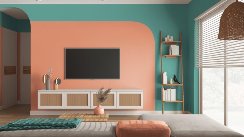
1. Orange: Energetic, Creative and Impossible to Ignore
Source: Shutterstock
Orange is one of the most psychologically stimulating colours available — it combines the physical energy of red with the optimism of yellow, and in colour psychology is strongly associated with creativity, enthusiasm and warmth. For a household that is rarely sitting still, it is a natural fit.
The range within orange gives you meaningful choices. A vivid, saturated orange makes an immediate impact and works particularly well as a feature wall in a living area or dining room — paired with neutral furniture in natural linen, timber or white, it reads as bold without being overwhelming. A more muted, terracotta-adjacent orange is easier to live with across a full room and sits comfortably alongside earthy tones, warm woods and rattan accents.
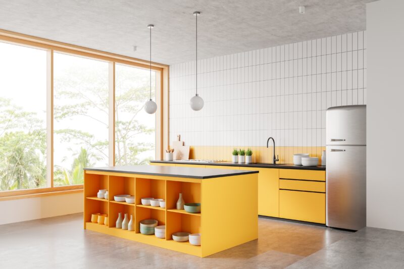
2. Yellow: The Colour That Carries Its Own Light
Source: Shutterstock
Few colours alter the mood of a room as immediately as yellow. It reflects light, lifts energy and creates an instinctive sense of warmth — which is why it has long been a popular choice for spaces where people gather. In colour psychology, yellow is associated with optimism, confidence and mental stimulation.
Softer, butter yellows work beautifully across a full room, pairing naturally with white trim and pale timber. Brighter, more saturated yellows are better reserved for accents — a single feature wall, a hallway, or areas where a short burst of energy is welcome rather than something you need to sustain over a long time. Either way, yellow is a colour that rewards boldness; used tentatively, it can read as flat.
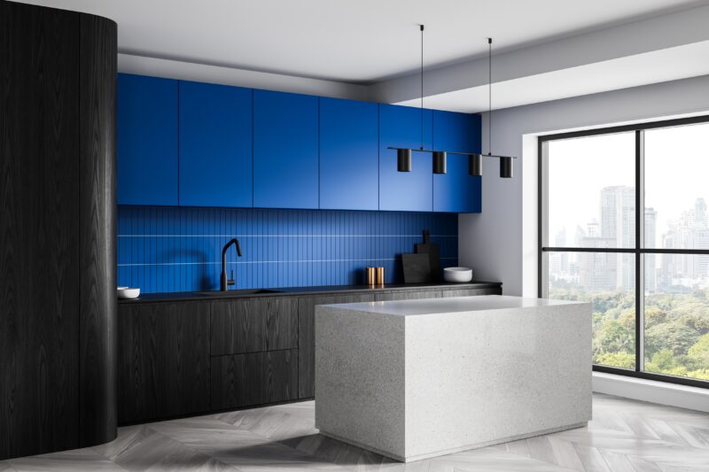
3. Electric Blue: A Statement Colour with Staying Power
Source: Shutterstock
Blue is the world’s most popular colour, but electric blue — vivid, saturated, unapologetically bright — occupies a very different psychological space from the soft, calming blues typically recommended for bedrooms. It is high-energy, visually striking and makes an immediate impression on anyone who walks into the room.
Used on a single feature wall, electric blue is one of the most effective accent colours available. It creates a strong focal point without requiring a complete commitment across all four walls. The key to making it work is restraint elsewhere: complementary neutral furniture — white, natural timber, light grey — prevents the colour from becoming visually exhausting and lets the wall do exactly what it is supposed to do.
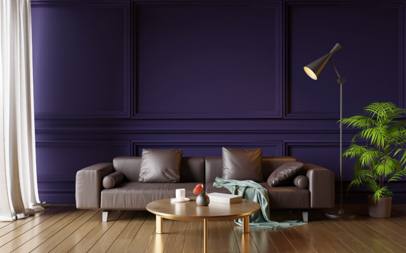
4. Purple: Ambitious, Creative and Unexpectedly Versatile
Source: Shutterstock
Purple carries associations with creativity, ambition and luxury — qualities that make it a more fitting choice for an adventurous household than its reputation might suggest. The range within the purple family is also broader than most people realise, from soft lavender at one end to deep eggplant at the other.
For a room with a sense of drama and personality, a rich, deep purple works particularly well in dining rooms and studies — spaces where the goal is atmosphere rather than relaxation. Paired with warmer accent tones (brass, amber, burnt orange) or with dramatic lighting — a chandelier or an architectural pendant — it reads as genuinely sophisticated. For a lighter touch, softer purple tones work well in bedrooms and creative spaces.
5. Red: Passionate, Powerful and Built for Impact
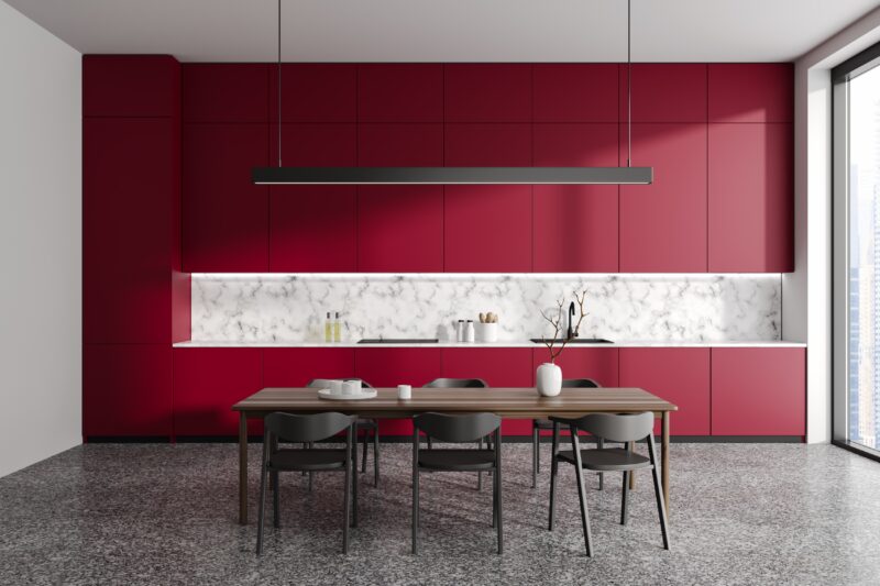
Source: Shutterstock
Red is the most psychologically stimulating colour on the spectrum. It raises energy, commands attention and is associated with confidence, determination and passion — which makes it the most naturally suited of all colours to a household that likes to make an impression.
It is also a colour that demands careful handling. Red works best in dining rooms, entryways and as accent walls rather than across an entire interior, where it can become visually fatiguing. A deep, brick-adjacent red is easier to live with than a pure, saturated red, and pairs exceptionally well with dark timber furniture, matte black fixtures and warm metallic accents. The key is balance: keep surrounding elements muted so the red remains the centrepiece rather than competing with everything around it.
6. Fuchsia: Bold, Joyful and Designed to Be Noticed
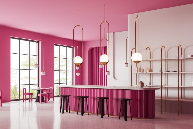
Source: Shutterstock
Fuchsia — vivid, purplish-pink and immediately eye-catching — is not a colour for the hesitant decorator. It is one of the most distinctive shades available and works precisely because it commits so fully to its own energy. In colour psychology, it is associated with confidence, playfulness and warmth.
For most homes, fuchsia works best in controlled applications: a single feature wall, an accent in a hallway or powder room, or as a strong contrast to an otherwise neutral interior. Used in this way, it becomes a genuine talking point without overwhelming the space. Pair it with white, deep charcoal or natural timber to let the colour register fully — busy surroundings will dilute the effect.
Frequently Asked Questions
What are the boldest paint colours for a living room?
Red, electric blue, deep purple and saturated orange are among the most impactful choices for a living room feature wall. For a full-room commitment, muted versions of orange (terracotta), yellow (butter yellow) and purple (dusty plum) are bolder than neutral palettes while remaining liveable day to day.
How do I use a bright colour without overwhelming a room?
The most effective approach is to use the bold colour on a single feature wall and keep the remaining three walls in a complementary neutral. Choose furniture in natural timber, white or light grey to provide visual relief. This gives the bold colour space to register without dominating the entire room.
What colours work well as accent walls in Singapore homes?
Electric blue, deep red, eggplant purple and vivid orange all make strong accent wall choices. In Singapore’s typically compact living spaces, a single bold accent wall adds significant personality without making the room feel smaller — provided the surrounding walls are kept light and the furniture is neutral.
Are bright paint colours hard to maintain?
Not inherently — but colour longevity depends more on paint quality than shade. High-quality paints with strong UV-resistant pigments hold their colour significantly longer than cheaper alternatives, which is particularly important for vibrant shades where fading is more visible. Using the correct paint for the surface (interior vs exterior) also plays a major role.
What colours pair well with bold wall colours?
As a general rule, bold wall colours work best with neutral furniture and accessories — natural timber, white, light grey, linen. Metallic accents (brass, copper, matte black) add warmth and sophistication without competing with the wall colour. Avoid pairing multiple saturated colours in the same space unless you have a strong design rationale for the combination.
Can I use fuchsia or purple in a small room?
Yes, with the right approach. Deep colours in small rooms can feel dramatic rather than cramped when used on a single wall rather than all four, and when the remaining walls are kept light. Good lighting also makes a significant difference — a well-lit room in a bold colour reads very differently from the same room with poor artificial light.
Find Your Colour, Own Your Space
The right bold colour does not just make a room look different — it makes it feel different. The six colours above each bring a distinct energy, and the best choice is the one that reflects how you actually want to live in the space. Start with a feature wall if you want to test the water, and build from there.
For help finding the right shade and finish within any of these colour families, visit nipponpaint.com.sg or speak to a consultant at your nearest Nippon Paint Colour Centre.
5 Colour Schemes Inspired by Korean Dramas For Your Home