The Korean Wave — or Hallyu — has never been stronger. From the record-shattering Squid Game franchise to sweeping sageuk period dramas and heartwarming slice-of-life romances, K-dramas have become a genuine part of Singapore’s cultural fabric. With Netflix alone reporting that Korean content now accounts for 8 to 9 percent of all global watchtime on the platform, it’s safe to say the phenomenon shows no sign of slowing.
Beyond the stories and the stars, what makes K-dramas so visually captivating is their colour direction. Every era, emotion, and aesthetic is communicated through palette — from the jewel-toned richness of palace dramas to the clean Scandinavian neutrals of contemporary romance. If you’ve ever found yourself admiring the interiors or landscapes in your favourite K-drama and thinking “I want that feeling in my home,” here’s how to translate those on-screen palettes into real wall colours.
Here are five K-drama inspired colour schemes to try — spanning the classic greats and the latest hits.
1. Dae Jang Geum / Jewel in the Palace — Royal Jewel Tones
Source: ddol-mang/Flickr
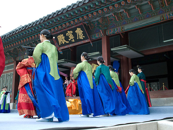
One of the most legendary K-dramas of all time, Dae Jang Geum (大长今) follows Jang Geum’s remarkable journey to become Korea’s first female royal physician. As a sageuk (historical period drama) set in the royal court of the Joseon Dynasty, its colour palette is defined by deep, saturated jewel tones — the kind of hues that communicate power, ceremony, and timeless elegance.
Jang Geum’s iconic hanbok features a vibrant blue-toned green paired with a royal blue skirt and red trimmings. The royal family don robes of rich red and gold. Together, they create a palette that feels genuinely regal — and translates beautifully into a feature wall or accent scheme.
How to get the look: Use a deep jewel green — such as Nippon Paint’s Emerald (9048) or Bamboo Tile (NP BGG 2641 D) — as your primary feature wall colour. Introduce accents of royal blue through cushions, curtains, or decorative pieces, with touches of gold through lamps or frames to complete the palatial feel. If a full jewel-toned wall feels too bold, these colours work equally well as accent tones against a neutral off-white base.
2. Reply 1988 — Retro Brights and Denim Blues
Source: Kpop Recent/Flickr
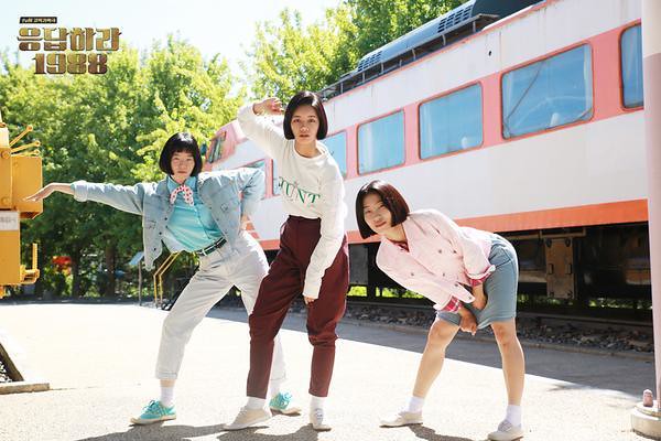
Of all the dramas in the beloved Reply series, Reply 1988 holds a special place — the final episode achieved the highest ratings in Korean cable TV history. Set in a tight-knit Seoul neighbourhood in the late 80s, it’s a story of friendship, family, and young love, and its visual aesthetic draws deeply from the era: denim-on-denim, earthy warm tones, and spontaneous pops of colour.
Think bold blues as a primary palette — the kind of indigo denim tones that defined 80s Seoul — with bright accents of sweet pink and warm orange woven through. The vibe is deliberately retro: rich, layered, and unafraid of colour. In 2026, the 80s-inspired interior aesthetic has made a strong comeback, driven by a broader cultural nostalgia that K-dramas like Reply 1988 helped ignite.
How to get the look: Try Nippon Paint’s Bustling Blue (NP PB 2847 T) or Venetian Blue (NP PB 2825 A) as your base wall colour, then inject personality through orange and pink accents — warm-toned cushions, retro posters, and vintage-style furniture. The funkier, the better.
3. Signal — Moody Contrast
Source: George Becker/Pexels
Signal is one of Korea’s most acclaimed thriller dramas — a time-bending, emotionally devastating story that uses its two timelines to brilliant visual effect. The present-day sequences are shot in cool, chic, desaturated tones that evoke the coldness of procedural investigation; the past glows in warmer, more saturated hues that carry the weight of memory and emotion.
The result is a palette of deliberate contrast — grey and off-white for the modern, controlled present; soft yellows and warm pink-oranges for the warmer, more human past. This approach of using two distinct palettes in different zones of a home is a genuinely effective interior design technique in 2026, particularly for open-plan spaces where you want to visually distinguish areas without physical dividers.
How to get the look: Paint your main living or work area in a timeless grey — Nippon Paint’s Trojan Gray (NP N 1996 D) or Millenium Gray (NP N 2036 D) — accented with crisp off-white. In warmer zones (a reading corner, a bedroom, a dining nook), introduce a soft yellow like Sweet Yellow (NP YO 1143 T) or a warm apricot tone to replicate the drama’s emotive warmth.
4. Crash Landing on You — Clean Neutrals with Touches of Warmth
Source: KoreanDrama Blog/Flickr
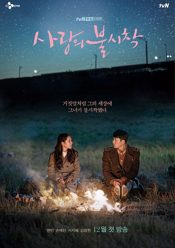
Crash Landing on You — the story of a South Korean heiress who accidentally paraglides into North Korea and falls in love with an army officer — remains one of the most-watched K-dramas in streaming history and one of the highest-rated in MyDramaList’s 2026 rankings. Its colour aesthetic is pure romantic escapism: clean, restrained neutrals that give the sweeping romance room to breathe, with occasional touches of warmth.
The Swiss and Korean settings lean into soft whites, pale greys, and cool blues — colours that feel like fresh mountain air and promise both calm and possibility. If Winter Sonata was the originator of K-drama’s love affair with pale, wintry palettes, Crash Landing on You is its contemporary heir.
How to get the look: Use Nippon Paint’s Flight of Doves (NP N 3068 P) or Pebble Shore (NP N 3132 T) as your wall base — soft, airy neutrals that evoke cool, clean mountain air. Layer in hints of pale blue through soft furnishings and add warmth through natural wood furniture. A pale rose accent — perhaps in a throw or a cushion — nods to the romance at the centre of it all.
5. When Life Gives You Tangerines — Warm Earth and Citrus

Source: allkdrama/Flickr
One of the most celebrated K-dramas of 2025, When Life Gives You Tangerines (starring IU and Park Bo-gum) is a slow-burning multigenerational love story set against the lush, sea-kissed landscape of Jeju Island. It’s a drama about perseverance, ordinary beauty, and the texture of a life well-lived — and its colour palette reflects all of this: warm earthy neutrals, sun-bleached whites, terracotta, and the signature amber-orange of Jeju’s famous tangerine harvest.
The aesthetic is simultaneously grounded and radiant — a palette that feels deeply rooted in the natural world while glowing with warmth and optimism. In 2026, this earthy, biophilic approach to interior colour is one of the most popular design directions in Singapore, making this drama’s palette particularly well-timed.
How to get the look: Warm terracotta tones — try Nippon Paint’s Laughing Out Loud (NP YO 2422 D) for a deeper, earthier orange, or Keepsake Rose (NP R 1337 A) for a softer, pinkish terracotta — make a beautiful feature wall. Ground the look with warm off-white on the remaining walls (Whispering White (NP OW 1001 P) or Creamy Beige (NP OW 2234 P)), and complement with natural rattan, linen, and wooden furniture for the full Jeju-island-life feeling.
Find Your K-Drama Palette with Nippon Paint
Whether you’re channelling the jewel-toned grandeur of a palace drama or the quiet warmth of a slice-of-life romance set on Jeju Island, Nippon Paint’s range of over 2,300 colours gives you the tools to bring your favourite on-screen world home.
Use the Nippon Paint Colour Visualiser app to preview how any of these shades will look on your actual walls before you commit — available free on the App Store and Google Play.
Explore the full colour range at nipponpaint.com.sg/colours/find-your-colour/.
Mixing & Matching - Unconventional Paint Colour Ideas